 All case studies
Brand implementation
GCSG
The brief
GCSG came to us with a new visual identity already established, including a logo, colour gradients, fonts and a series of graphic shapes derived from the GCSG letterforms. Our role was to take those core elements and turn them into a practical, coherent visual system that could work across the organisation’s day-to-day communications.
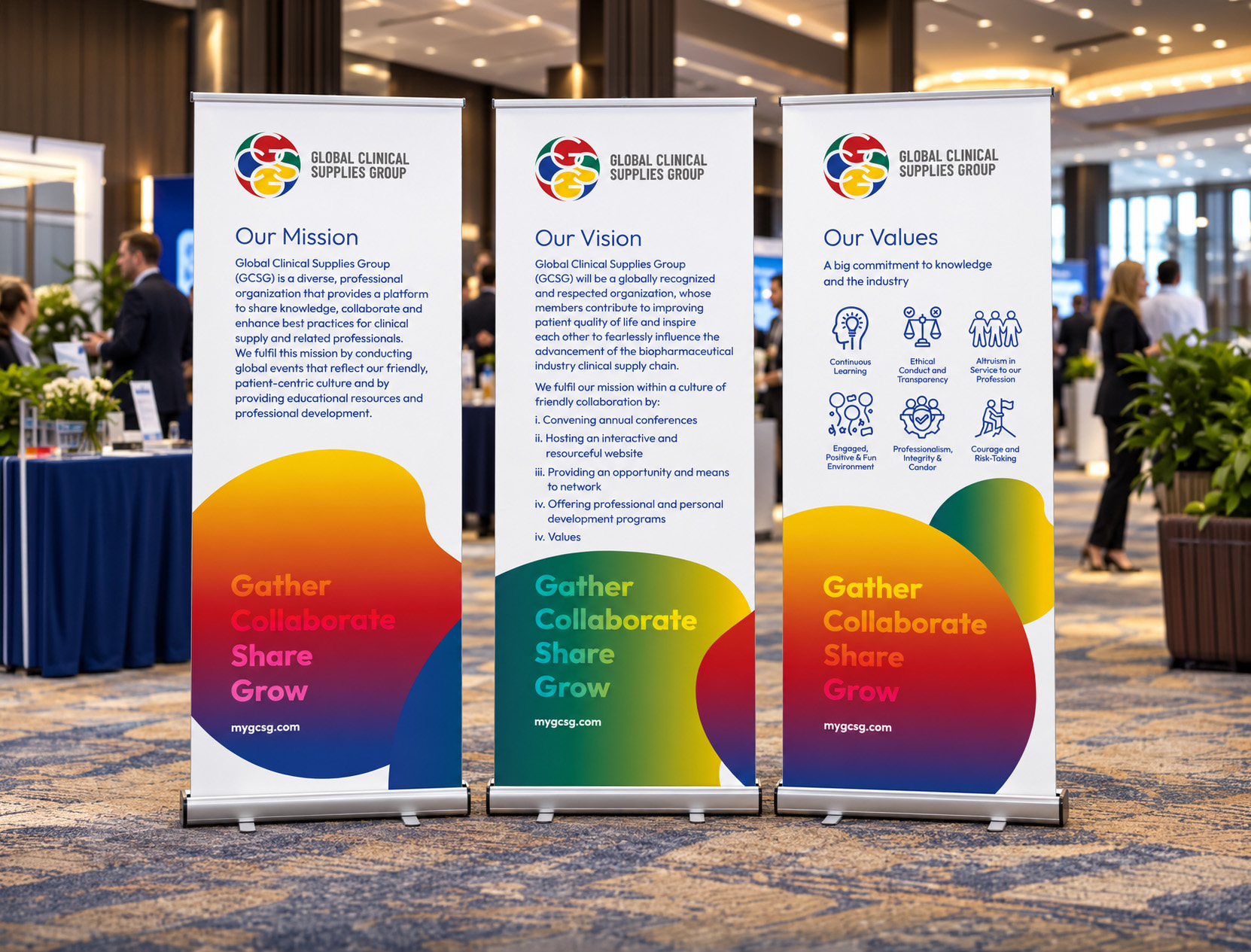
The first requirement was a comprehensive set of brand guidelines, showing internal teams, partners and suppliers how to apply the new identity consistently across print and digital materials. Alongside the guidelines, we developed examples of how the brand could work in practice, including exhibition backdrops, banners, email signatures, Microsoft Teams backgrounds and PowerPoint presentations.
The wider aim was to give GCSG a recognisable visual language that could be applied confidently to a growing range of communications without losing the integrity of the original identity.
Our approach
We began by exploring how the supplied brand elements could work together rather than simply documenting them. The gradients, typography and letterform-inspired graphics became the basis of a flexible design system, with clear principles for scale, positioning, colour and composition.
As the guidelines developed, we applied those principles across a wide range of real-world examples, effectively testing the identity as we built the rules around it. This gave GCSG both a practical reference document and a strong library of initial applications.
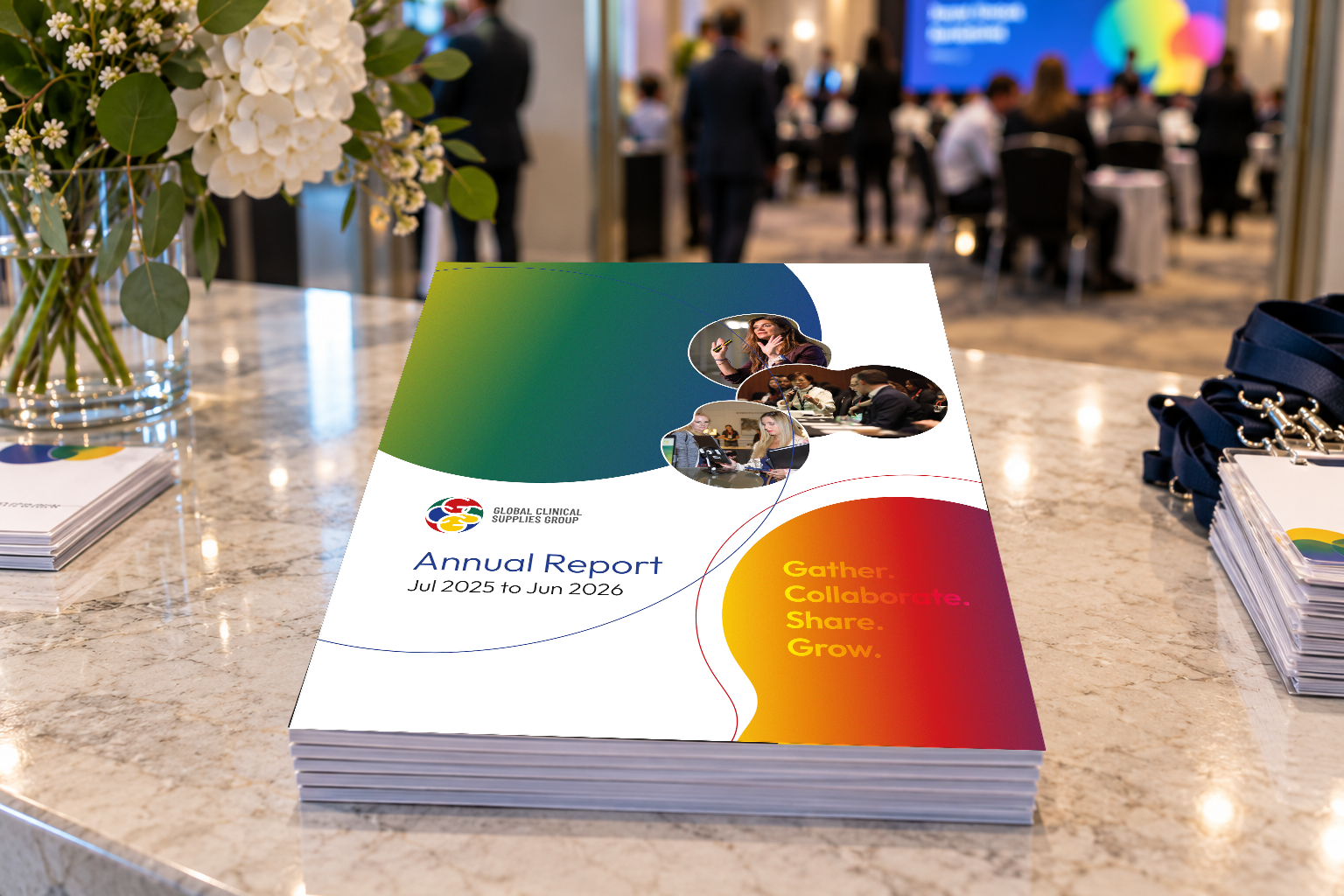
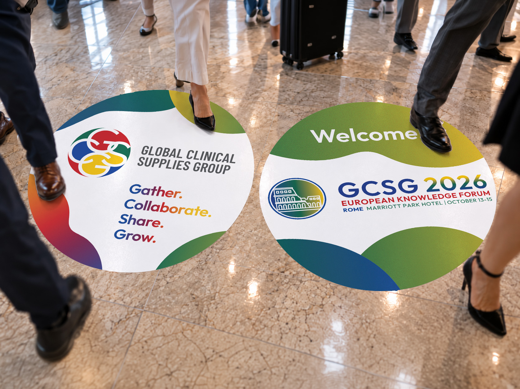
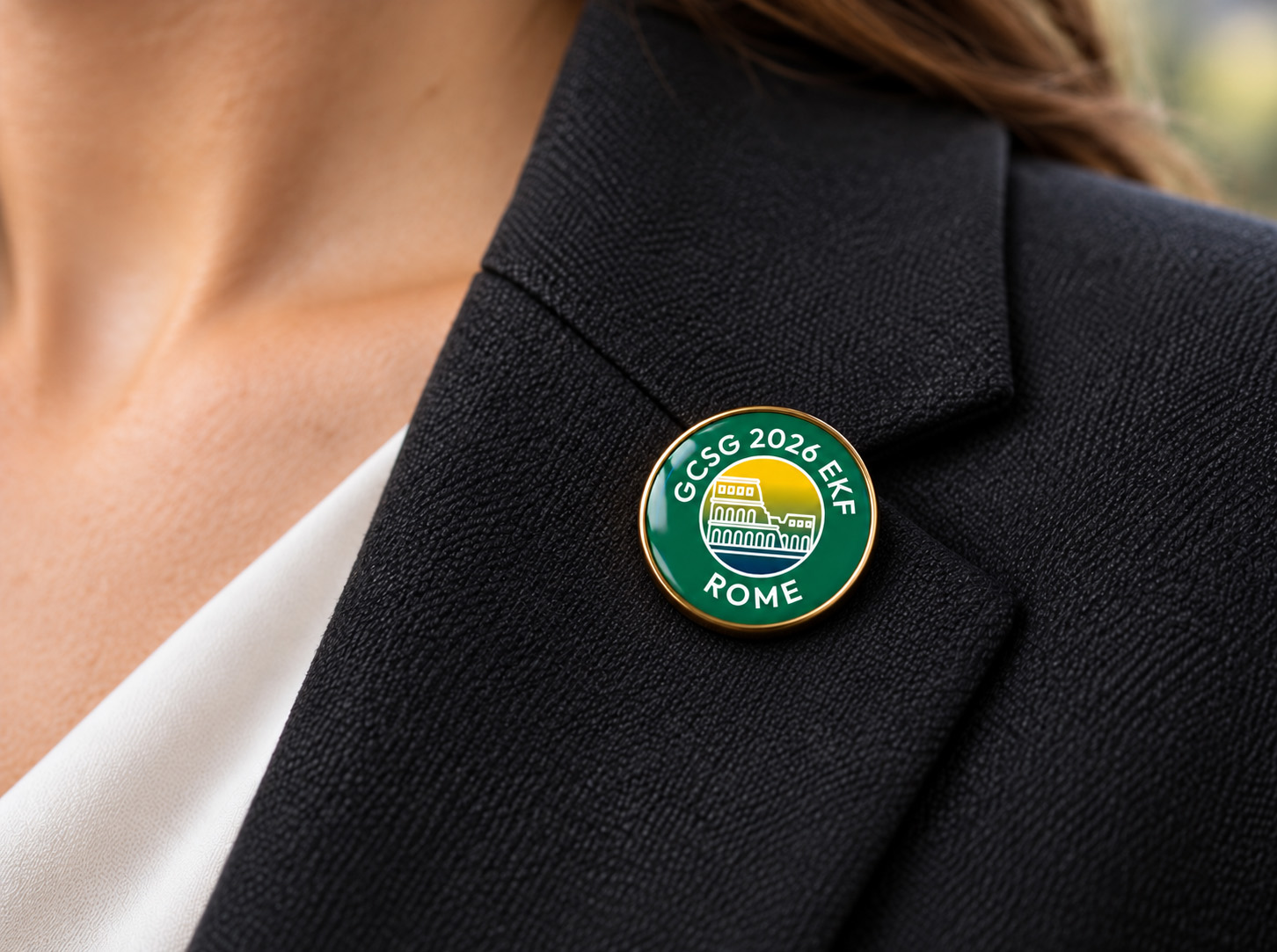
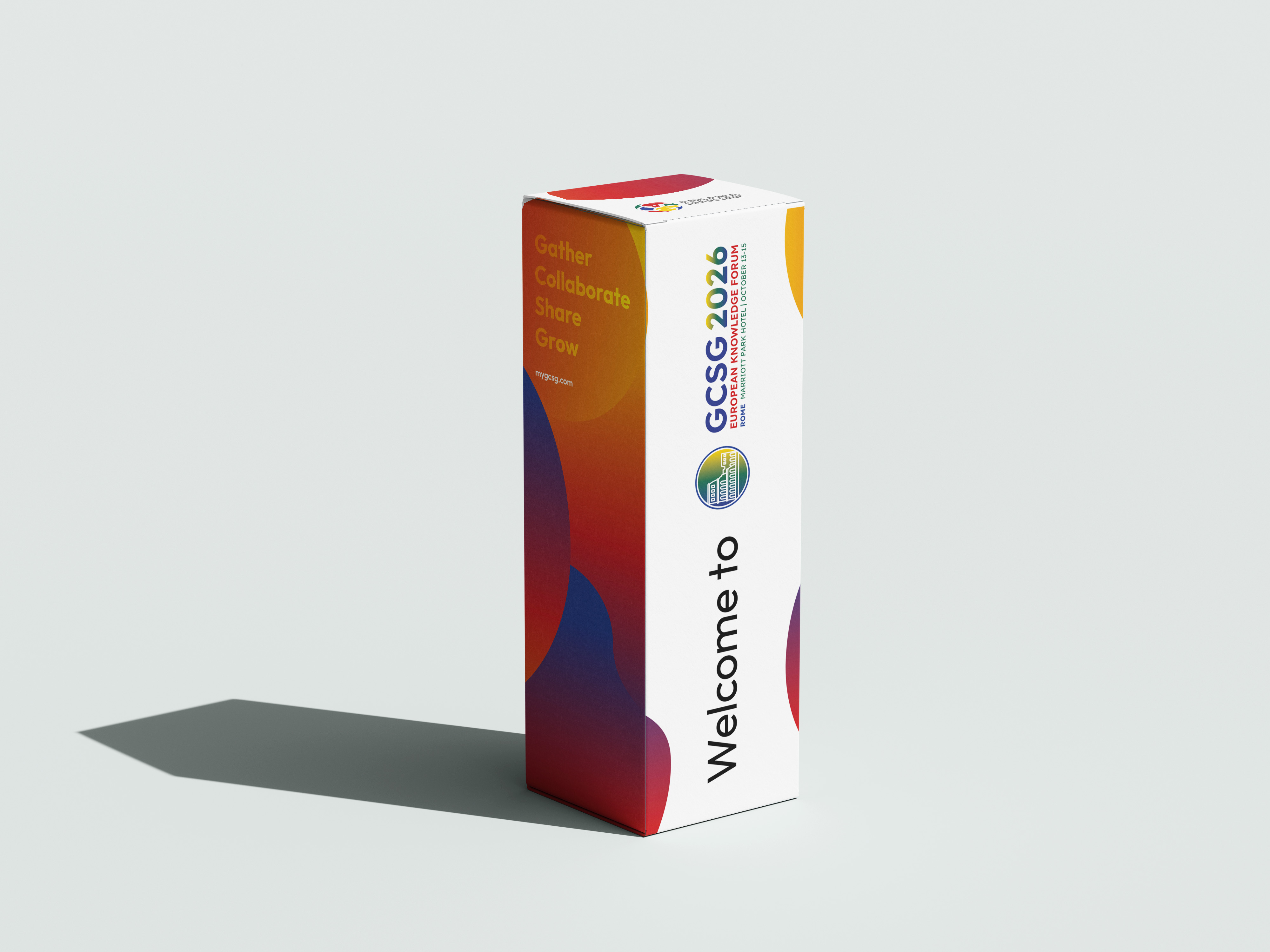
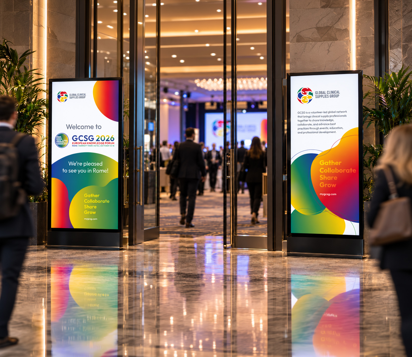
Since then, that visual language has continued to evolve across an increasingly varied range of materials, from floor graphics and digital screens to annual reports, conference identities and branded gift bags.
Whatever the format, our role is to maintain the same recognisable GCSG character throughout, allowing the brand to remain consistent while still having enough flexibility to work effectively across very different communications.
Next project
NHS Wales